
St. Jude Children's Research Hospital
Case study
Campaign Style Guide, Landing Page Redesign, Icon Set, Product Video
SKILLS: Creative direction, Branding, UX/UI design, Animation, HTML, CSS
Onboarding

St. Jude Donation App widget on a mobile screen
ALSAC, the fundraising organization for St. Jude Children's Research Hospital, was in need of a landing page redesign to reduce the time and effort for online merchants to fundraise for St. Jude. For the sake of clarity, I will be referring to ALSAC as St. Jude since theirs is the branding identity I will be referencing in this project.
St. Jude provided:
Target audience and industries they belong to
App features to highlight
Direct competitors
Strategy

Vision
Reduce the time and effort for online merchants to fundraise for St. Jude.
Goal
To increase funds raised for St. Jude by allowing businesses to seamlessly integrate donating to St. Jude into their online stores.
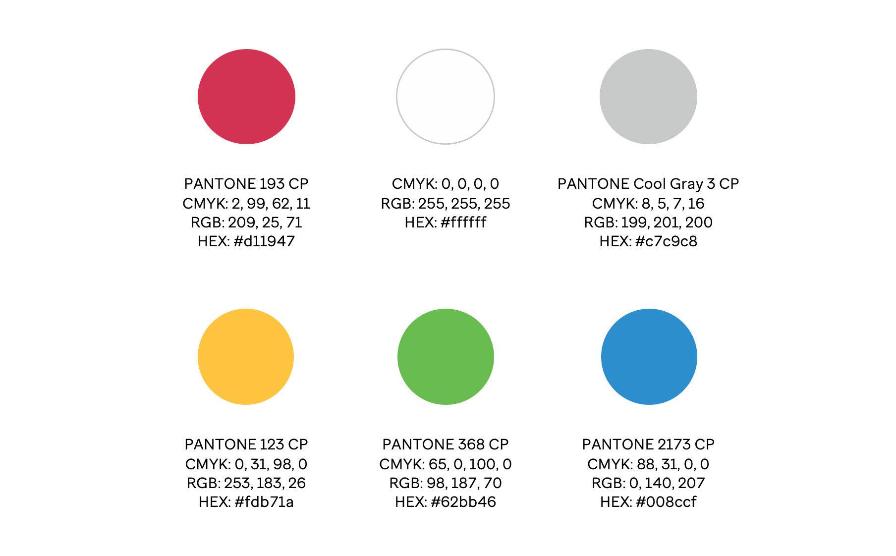
St. Jude Color palette
Objectives
Creating a visual language style guide
Creating a journey map
Build the landing page prototype
Test and implement findings as needed

Existing iteration of the app widget on a mobile screen
Ensure that users understand the app's functionality and how it works
Providing a responsive experience to the user
Prerequisites:
Adhering to branding guidelines
Redesigning while keeping the existing working features of the landing page
Focus areas:
Components:
Information about the app
Installation instructions
Benefits for merchants supporting St. Jude
Contact form
Link to FAQ page

St. Jude Clicking Hand Icon
Design
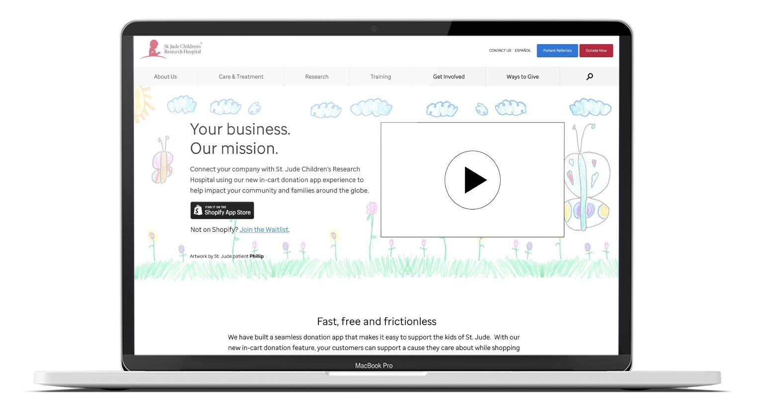
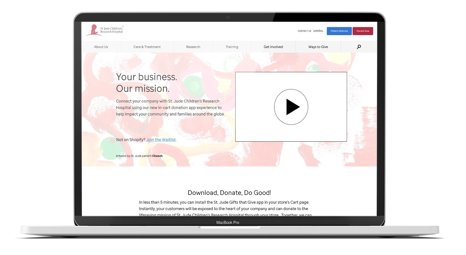
Existing landing page on a laptop screen
The existing landing page and user research provide insights into user expectations and preferences. Users are interested in:
Learning how the donation widget works
Seeking feedback and case studies from other businesses
Finding details about installation and platform availability
User personas

Micro businesses
Hyper-local
Single location
Owner/Operator

Small business
Local or online only
Small staff
Single location
Niche audience

Mid-market
Regional business
Have a mix of online and limited physical locations
Online only with multi-state reach

Sm/mid-size corporate
Business owners or decision-making employees
National reach, Multiple physical locations and online presence
Top challenges for these personas include:
Lack of capital
Cash flow
Recruiting/retention of employees
Marketing/advertising
User need statement
Merchants need an easy way to collect donations in order to fundraise for St. Jude.
Job stories
Find information about the St. Jude Donation App's purpose and the St. Jude mission.
Find information about the potential benefits to the merchant when they choose cause marketing.
Find information on how to the St. Jude Donation App works.
Find the link to the Shopify app listing for the St. Jude Donation App in order to install it.
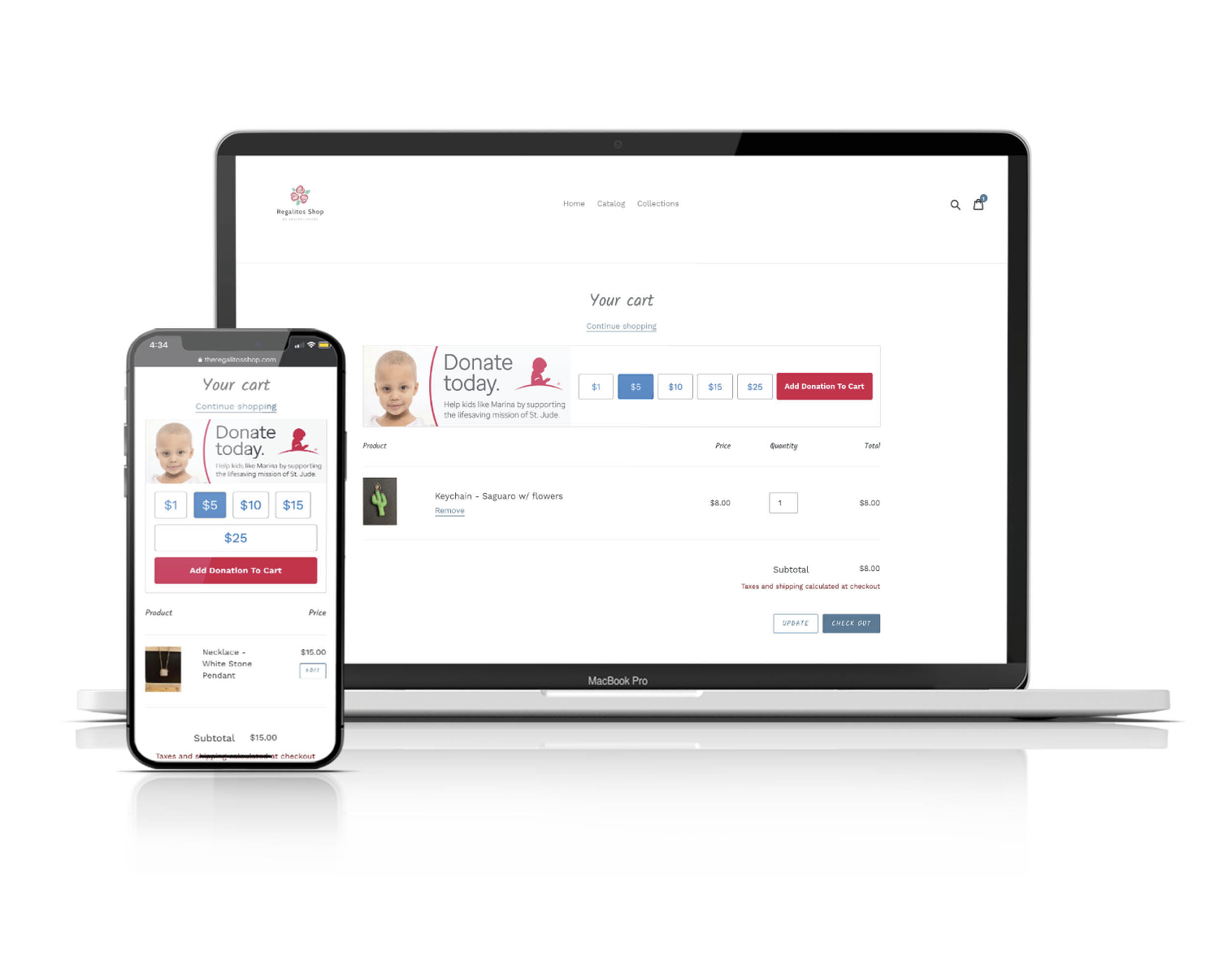
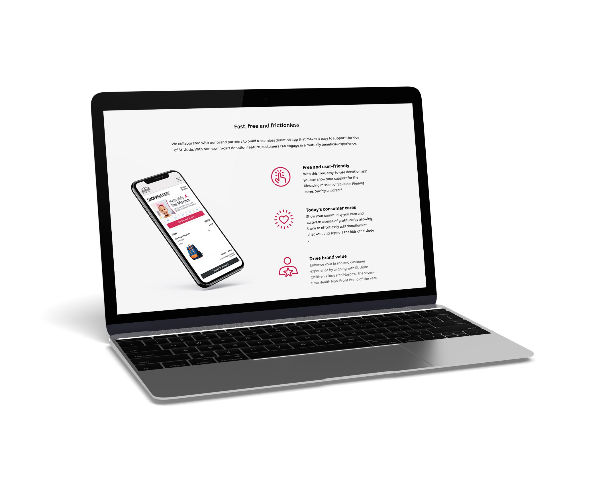
St. Jude Donation App Widget on Laptop and mobile screens
How might we…
make it easy to give to St. Jude while shopping online?
Ideation

St. Jude Sans Font
The process begins by gathering existing brand identity resources:
Guidelines
Fonts
Icons
Photography
Patient artwork
Style guide
Fonts, colors, iconography, and patient art were selected from brand materials.
Merchant stock photography should look like a candid lifestyle shot and avoid an overly posed and fabricated image.

Selected brand iconography

Brand Color palette

Selected patient art samples

Merchant photography with a candid feel
Journey map

Merchant begins the journey on a third party site, like social media, and ends when St. Jude collects the amount raised
Prototyping
Low-fidelity variants
Two variants are developed while creating low-fidelity wireframes that switch the order of sections of information of interest to the user.

Low-fidelity wireframes that include screenshots of basic page components
High-fidelity mockups
These aim for richer designs that are attainable within the existing website framework.

High-fidelity mockups including refined style choices and imagery
MVPs
Developed based on the established variants for testing.
Variant 1 prototype on a laptop screen
Variant 2 prototype on a laptop screen
Testing and implementing
Round 1
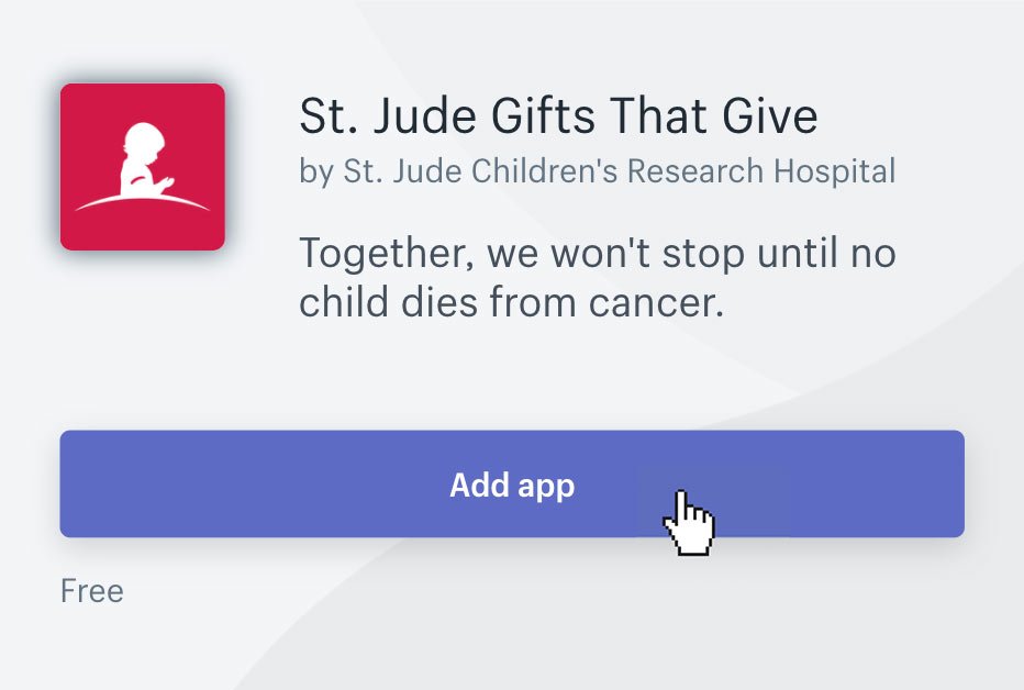
Mouse pointer hovering over St. Jude Shopify App listing's 'add app’ button
Does the landing page support the following objectives?
Variant 1: Merchant with a business on Shopify will click through to the Shopify listing page to install the app on their store
Variant 2: Merchant with a business on another platform will fill out the form to express interest in the app
Findings:
Page is wordy and long, should be compacted, made simpler
Users preference on relevant information
Description is unclear, users want more simple and concise information
Some users didn't understand the purpose of having both a 'Download Now' button and the contact form
Users wanted to know more of the benefits for their businesses
Most users missed the header CTA
Users would like a video about the app’s functionalities
Users requested a video explaining how the app works
Next Steps:
Revise page content and compact
Explore visual ways to portray content to reduce length
Create how it works demo video
Make CTAs more prominent
Round 2

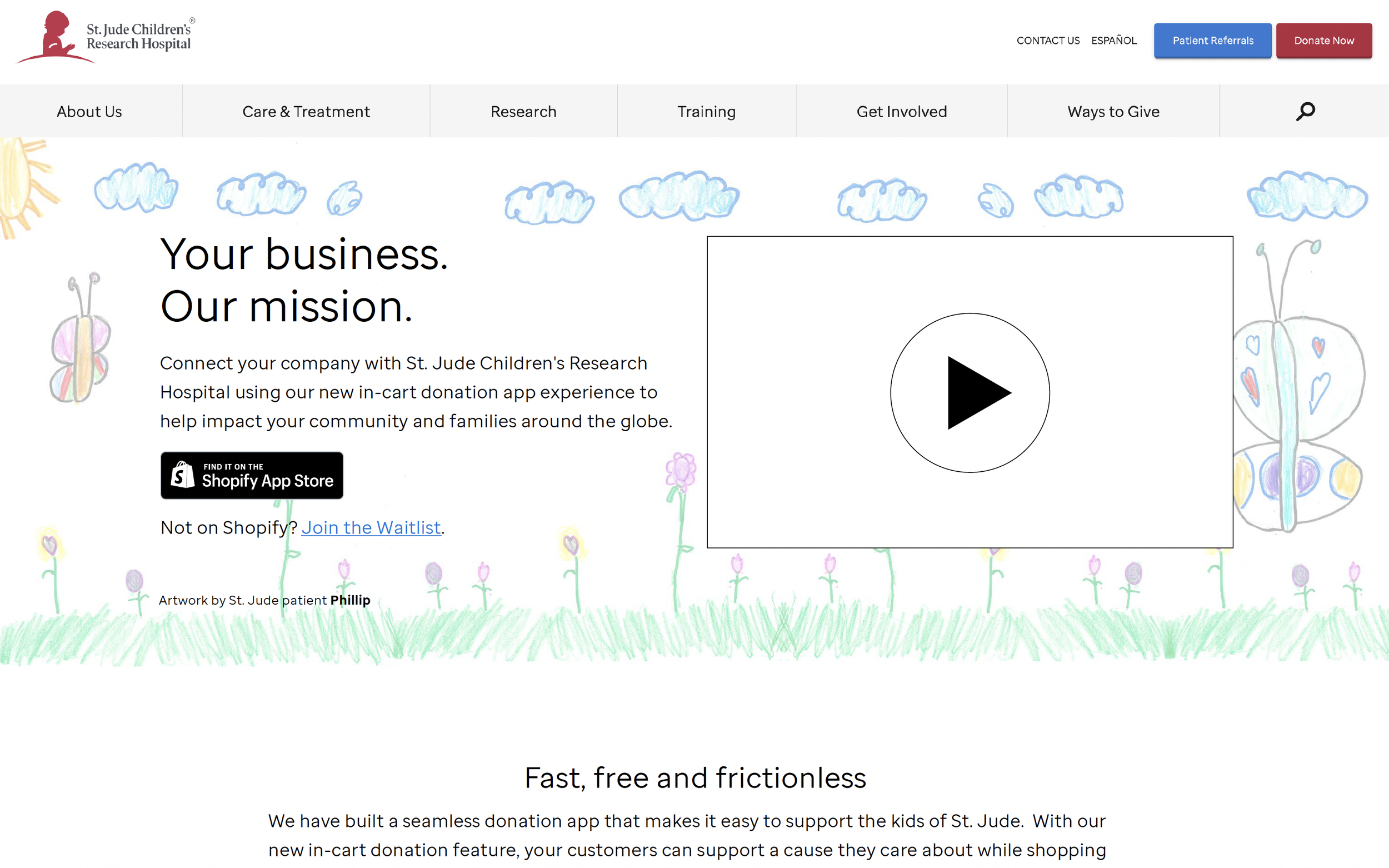
Patient art-focus landing page on laptop screen

Merchant-focus landing page on laptop screen
Does the landing page support the following objectives:
Merchant with a business on Shopify will click through to the Shopify listing page to install the app on their store
Merchant with a business on another platform will fill out the form to express interest in the app
Findings
Users want merchant testimonials and case studies for proof of legitimacy.
Generally users thought the information was sufficient
Some users want to see how many businesses are using the app and how much has been fundraised
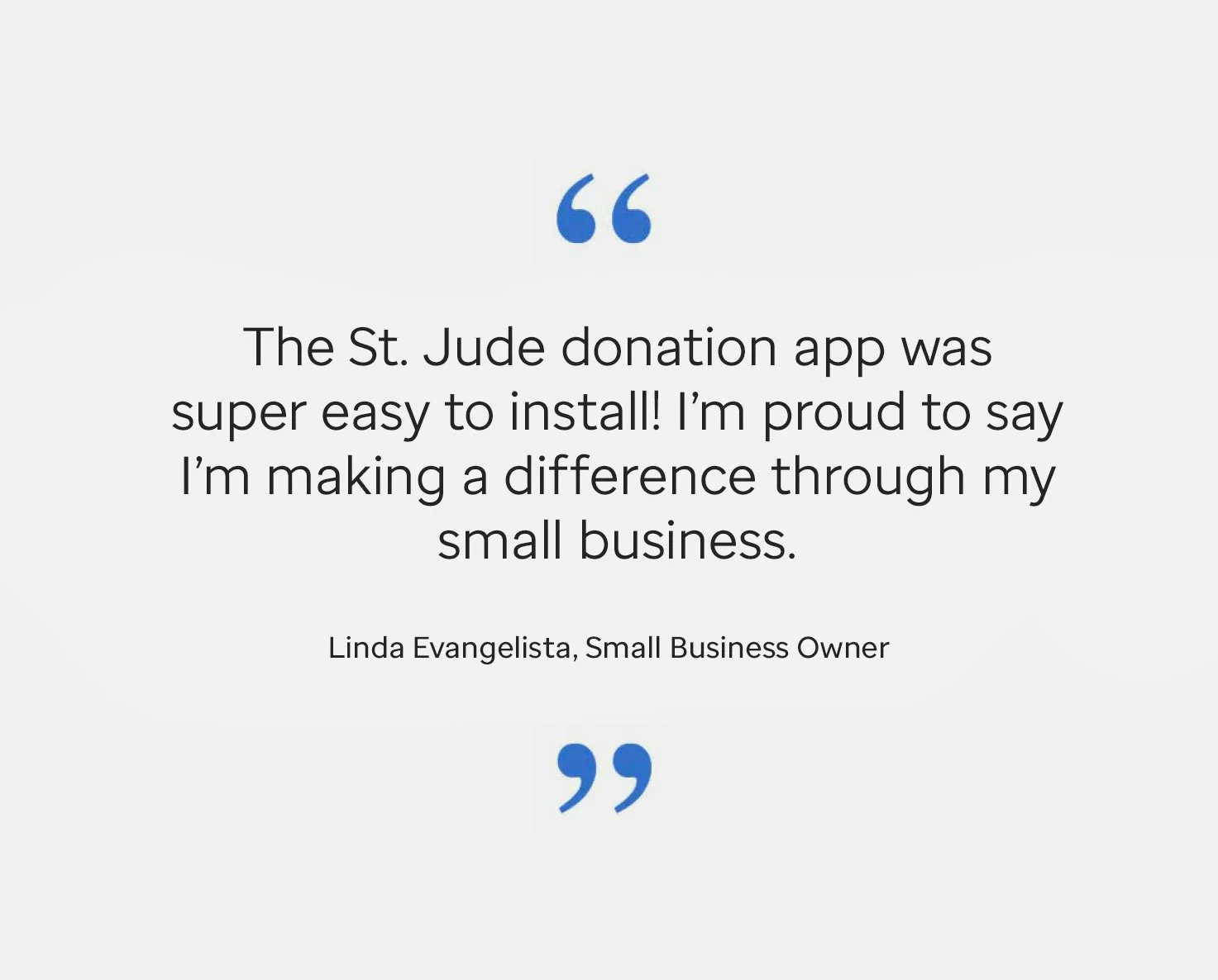
Testimonials would build proof of legitimacy and trust
Next Steps:
Revisit language to use terms familiar to merchants
Once how it works demo video is done, add to listing
Once testimonials are collected, add to header
Test findings helped address the following issues:

The merchant photography design was preferred among users
Page length
Content clarity
Prominence of CTAs
Addition of a how-it-works demo video to project scope
Inclusion of testimonials are pending upon collection.
Launch
The St. Jude Donation App and the finished redesign of the landing page published simultaneously after the second round of testing.
Results
The improved landing page design tailored to merchants makes the process easy for users who visit the page and install the app, as they have accurate expectations of the process and increases user satisfaction.

User testing provided invaluable feedback to create a page merchants could navigate and understand
The new design successfully addresses the need to simplify the process of making fundraising for St. Jude easier for merchants with a philanthropic heart.

Landing page in mobile screens
Post-launch
How-to Promotional Video
The St. Jude Donation App’s How-to promotional video was finished after the launch of the app and landing page. It was featured on the Shopify app listing page.
Bonus
Animated icons
During Ideation and Prototyping there were several delayed design approvals and pivots while QA was being tested on the app widget, as any timeline for a project that is being tested thoroughly would. While I waited, I found myself imagining colored flat versions of the expansive St. Jude iconography suite and how they would behave in a looping animation.

Customer support

Credit card
St. Jude did not have illustration guidelines, so I got to work on this collection with broad creative freedom.

Advertisement

Delivery
My hope was to prepare a library of ready-made animations that could be used in the how-to video, but the creative direction pivoted to a more serious, straight-to-the-point approach that did not incorporate these.

Bill

3 bills

Customer support representative

Barcode
Keeping the ecommerce theme present, I designed as many icons I could think of that would potentially be useful in any future marketing campaign creative.

Laptop

Merchant

revolving open/closed sign

mobile transaction
Inclusivity is an increasingly important aspect of visual design, as societal binary gender ‘norms’ keep getting blurred and the spectrum of gender becomes ever so colorful and visible.

Thumbs up skin tone 1

Thumbs up skin tone 2

Thumbs up skin tone 3

Thumbs up skin tone 4

Piggybank

Package

Wallet

T-shirt
An ecommerce iconography set would not be complete without including receipt, order tracking, and user review icons. This part of the user journey might get overlooked by a business since the purchase transaction is already complete, but the user experience is far from over after clicking that ‘Place Order’ button.

Receipt

Order tracking

Customer review